Kibo Sushi
A speculative design exploration and cold pitch presentation created to reimagine the digital experience of a growing Japanese food brand through thoughtful UI and storytelling.
00

Overview
Kibo Sushi is a fast growing Japanese food brand with a strong physical presence and a loyal customer base. The food is crafted with care, the brand carries meaning, and the in store experience feels warm and intentional. However, when that experience extended into the digital world, something felt disconnected. The website and app interactions did not fully reflect the quality, emotion, and clarity that customers experienced inside the restaurant. Discovering the brand, browsing the menu, and engaging digitally felt functional but not memorable. The opportunity was not about fixing broken systems, but about elevating an experience that already worked in the real world.
The Problem
This project began without a brief, a meeting, or an active requirement. It started as a cold pitch. The challenge I set for myself was simple but demanding. Could I clearly articulate what Kibo could become digitally, even before being asked? The goal was to translate the brand’s philosophy into a digital experience that felt calm, modern, and human. Something that did not try to shout for attention, but instead earned it through clarity and intent.
Instead of jumping straight into screens, I began with understanding. I spent time studying Kibo’s brand language, its cultural roots, and the way customers interact with food brands today. The name “Kibo” itself, meaning hope in Japanese, became a quiet anchor for the entire concept.
The pitch presentation was built as a narrative. It focused on how digital touchpoints could extend the dining experience rather than simply support transactions. The aim was to show how design thinking could help Kibo strengthen emotional connection, improve usability, and communicate its values more clearly.
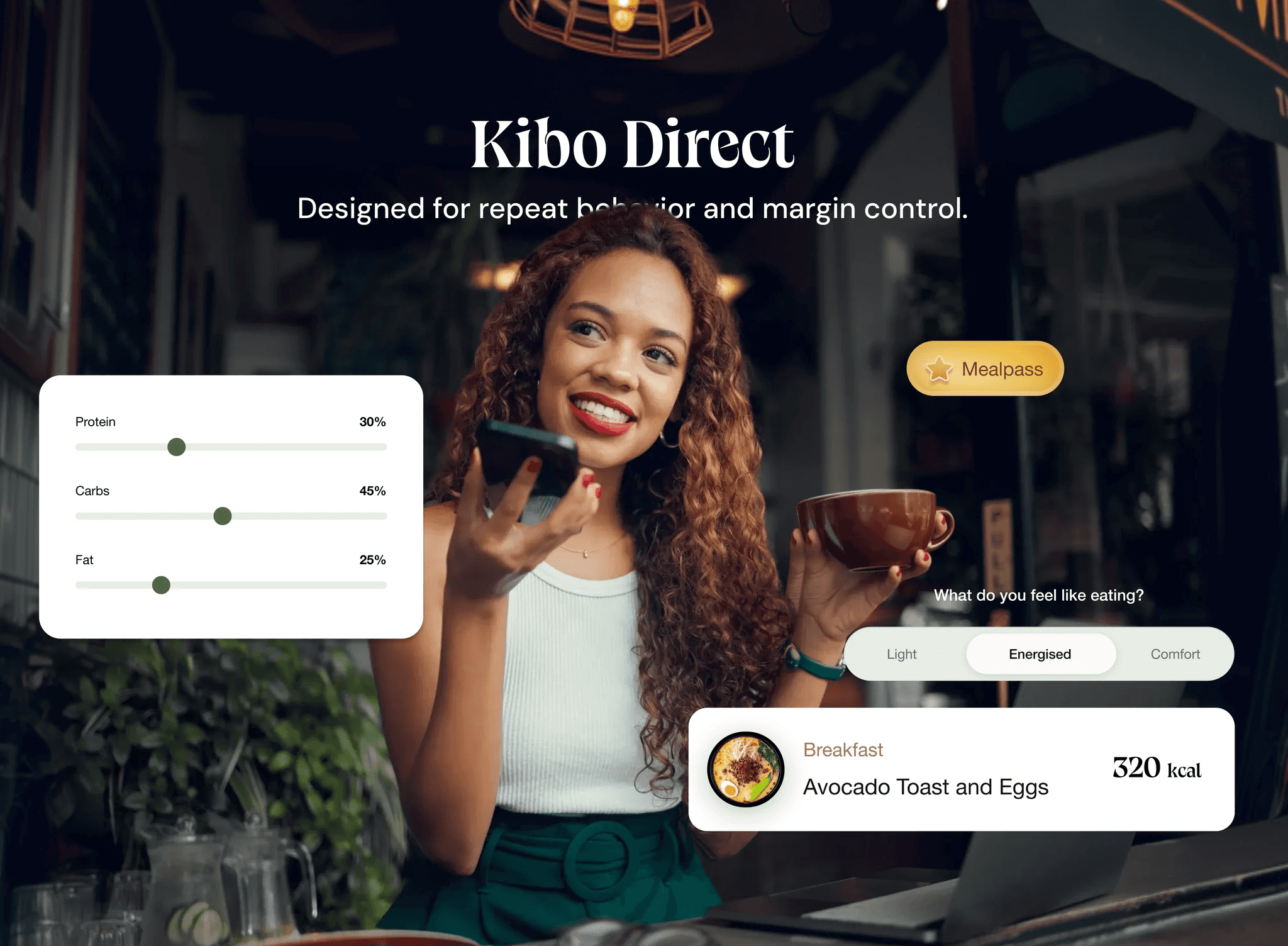
The visual direction leaned toward simplicity and restraint. The interfaces were designed to feel warm, confident, and approachable. Typography was clean and legible. Color and imagery were used sparingly, allowing the food and the brand story to take center stage.
Each screen was designed with a single question in mind. Does this feel effortless for the customer? If the answer was no, it was reworked.
01

02

03

see also


